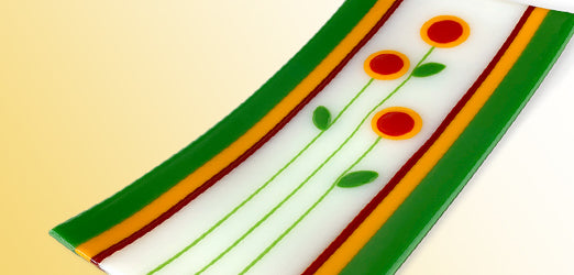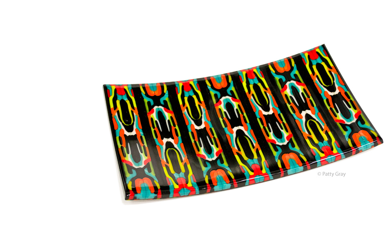
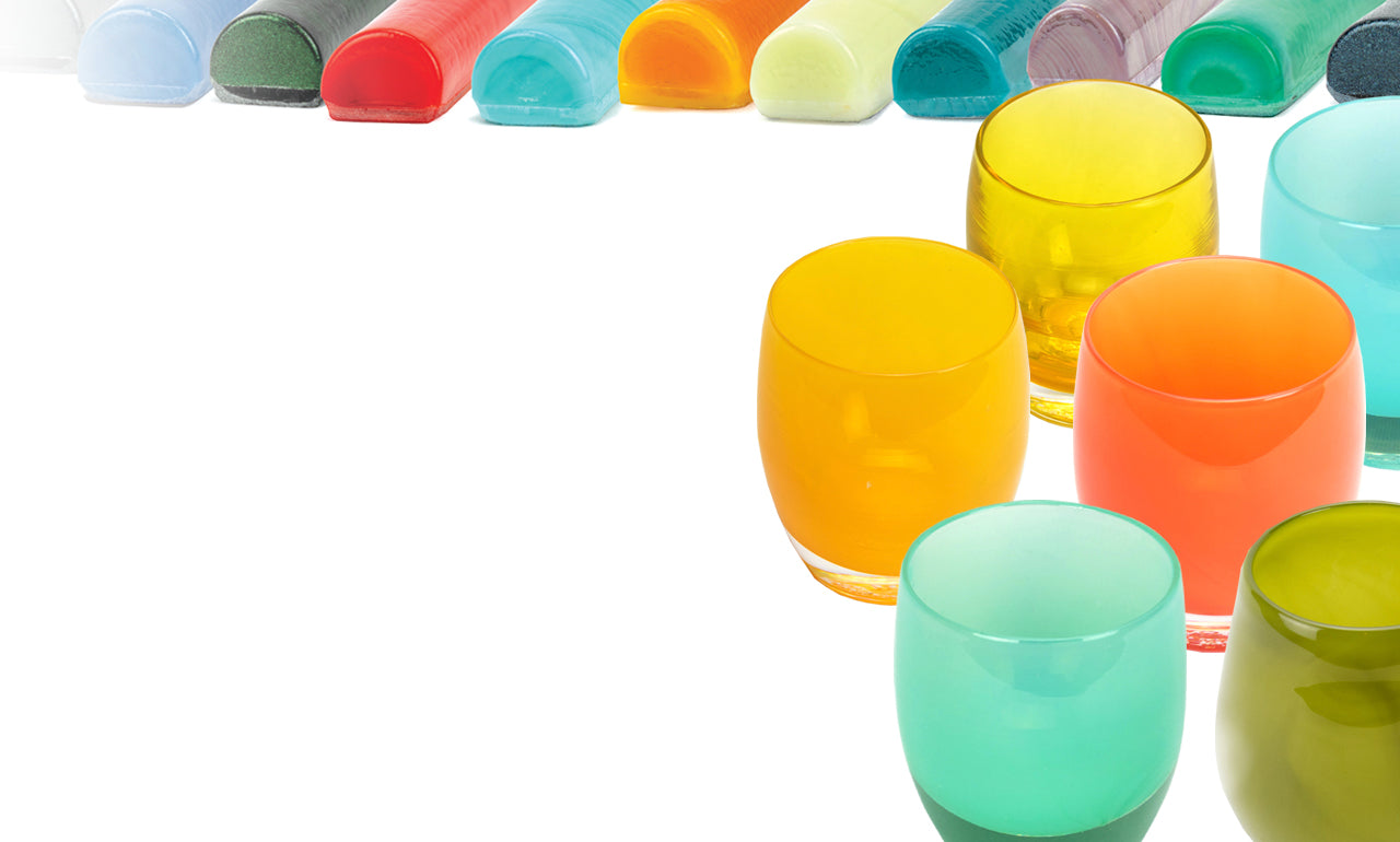

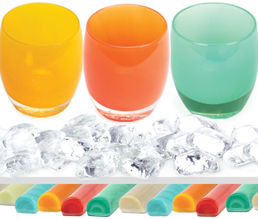
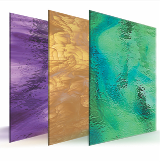
Glass Products
Oceanside Glass & Tile® is the manufacturer of the Oceanside Compatible® family of fusible glass products — an expansive range of fusible sheet glass and coordinating glass accessories. Learn more.

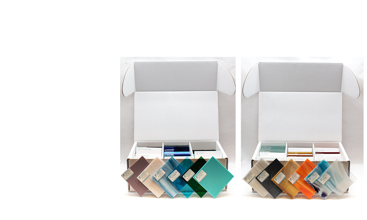
Education and Resources
Oceanside Glass & Tile is committed to providing useful tools to assist you as you create your own beautiful glass art — including information, support, and inspiration.
We also provide extensive firing and annealing schedules for use with our products.